Increasing Off-Season Tourism
Branding
City of Lanesboro
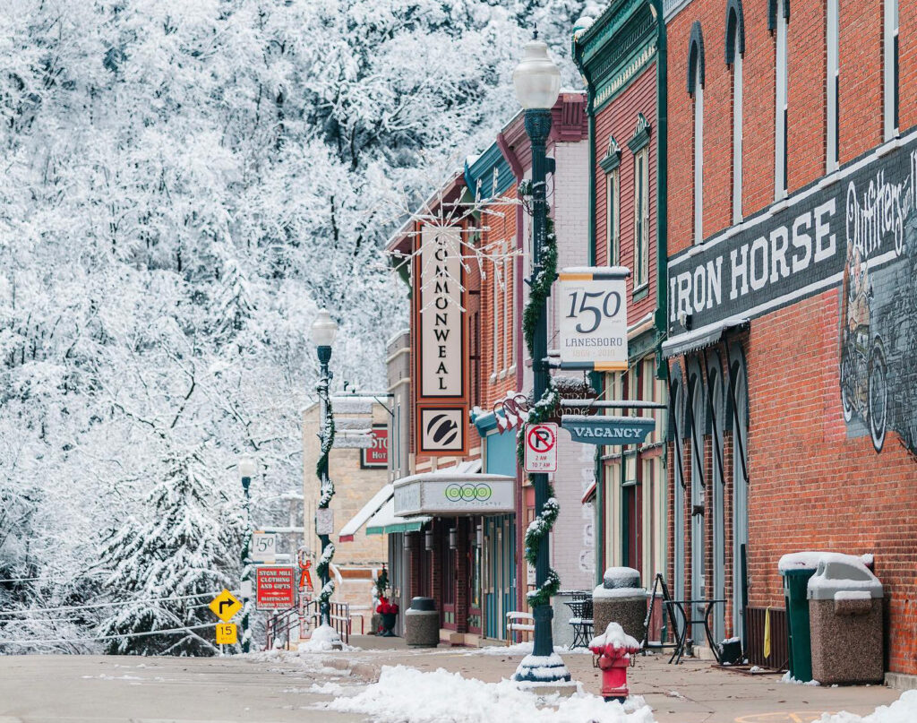
Lanesboro sought to be more accurately represented as a tourism destination, a business-friendly environment, and a close-knit community.
Between the interests of Lanesboro Chamber of Commerce, Economic Development Authority and the City, we found efficient ways to engage stakeholders and gather insights. We started by developing a survey to inform messaging and design, with goal of capturing Lanesboro’s authentic essence.
Following the survey, we developed three brand platform options, including a brand promise, key messaging and tagline options for the City, Chamber and EDA. These groups made their choice: “The gem of southeast Minnesota that connects nature and the arts, and supports a thriving community of small businesses.” Then, we developed logo options to bring the brand to life visually.
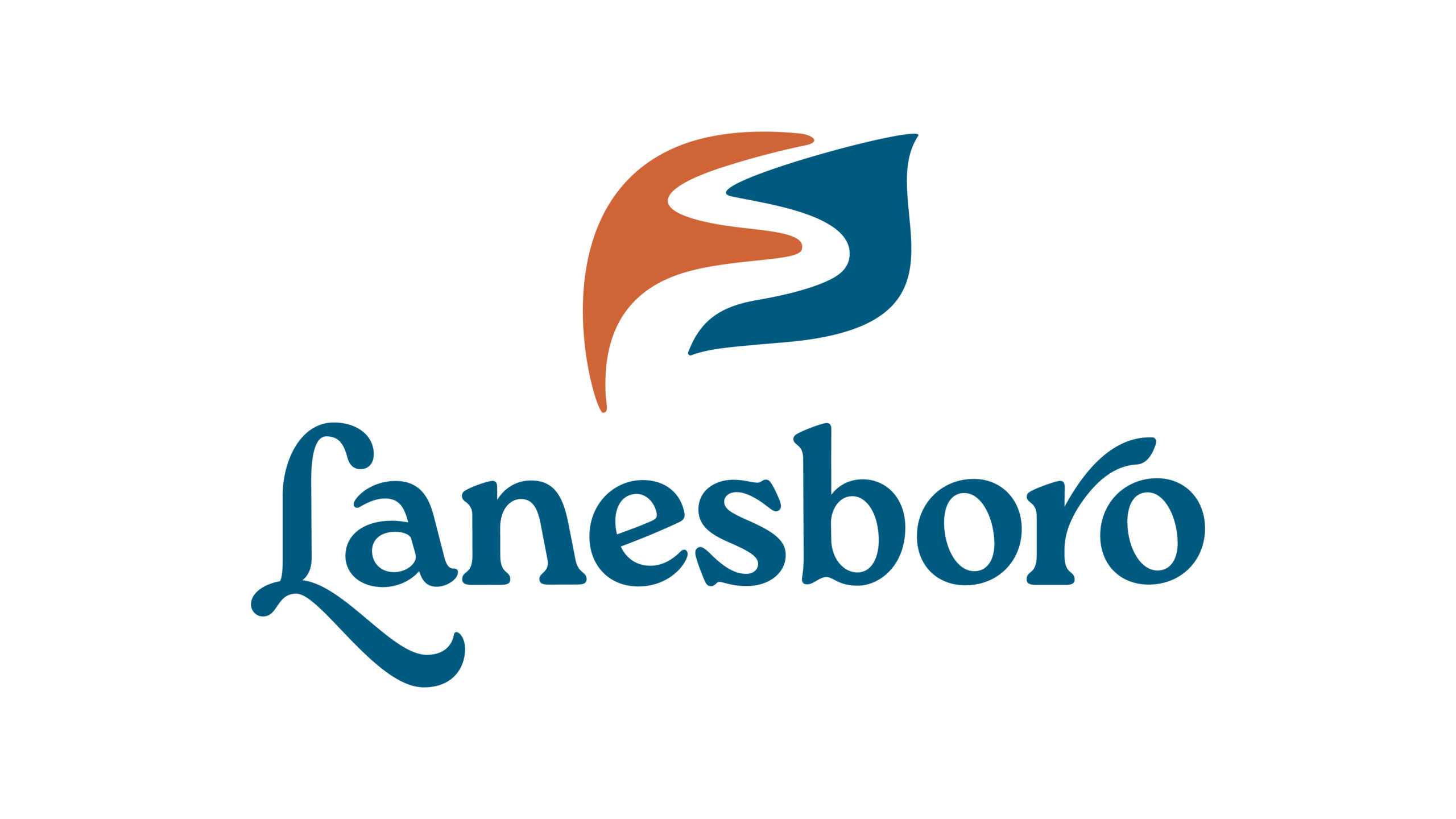
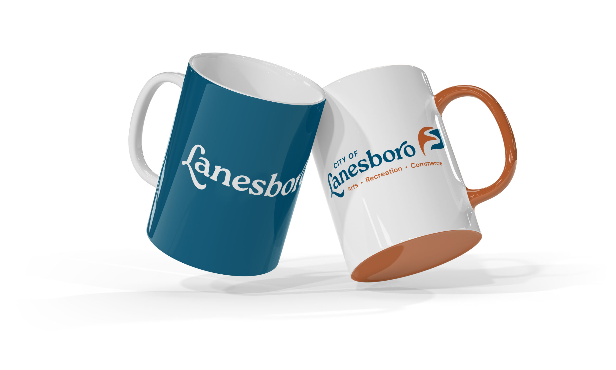
Lanesboro’s new brand stands out and highlights what this charming town has to offer. The icon in the logo represents the Root River flowing through a curved, organic leaf shape. The blue color represents Lanesboro’s natural surroundings including the river and dam, and an earthy copper brown references the bluffs and autumn colors the area is known for. The modernized wordmark gives a hand-crafted, artistic and approachable feel.

City of Lanesboro
Municipal
Branding