New Strategies for a New Normal
Advertising
Land Bank Twin Cities
For 15 years, Land Bank Twin Cities (LBTC) has been a catalyst for economic equity and community-driven development, turning real estate opportunities into pathways for growth. As LBTC celebrated this milestone, leadership saw an opportunity to modernize its brand, ensuring it reflected the organization’s expanding impact and forward-thinking approach. The existing identity needed to evolve—maintaining its core mission while embracing a fresh, modern look that would stand the test of time.
Neuger partnered with Land Bank Twin Cities to craft a refined brand identity—one that stayed true to the organization’s mission while embracing a more contemporary, versatile aesthetic. The rebranding process focused on:
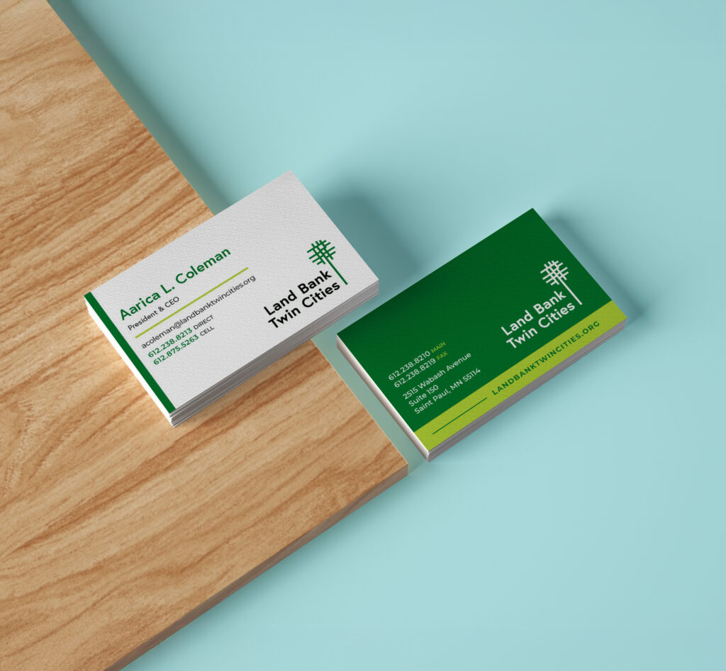
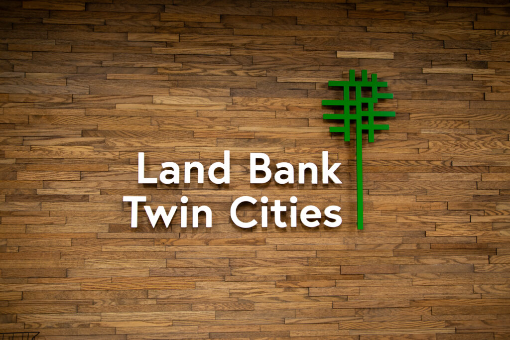
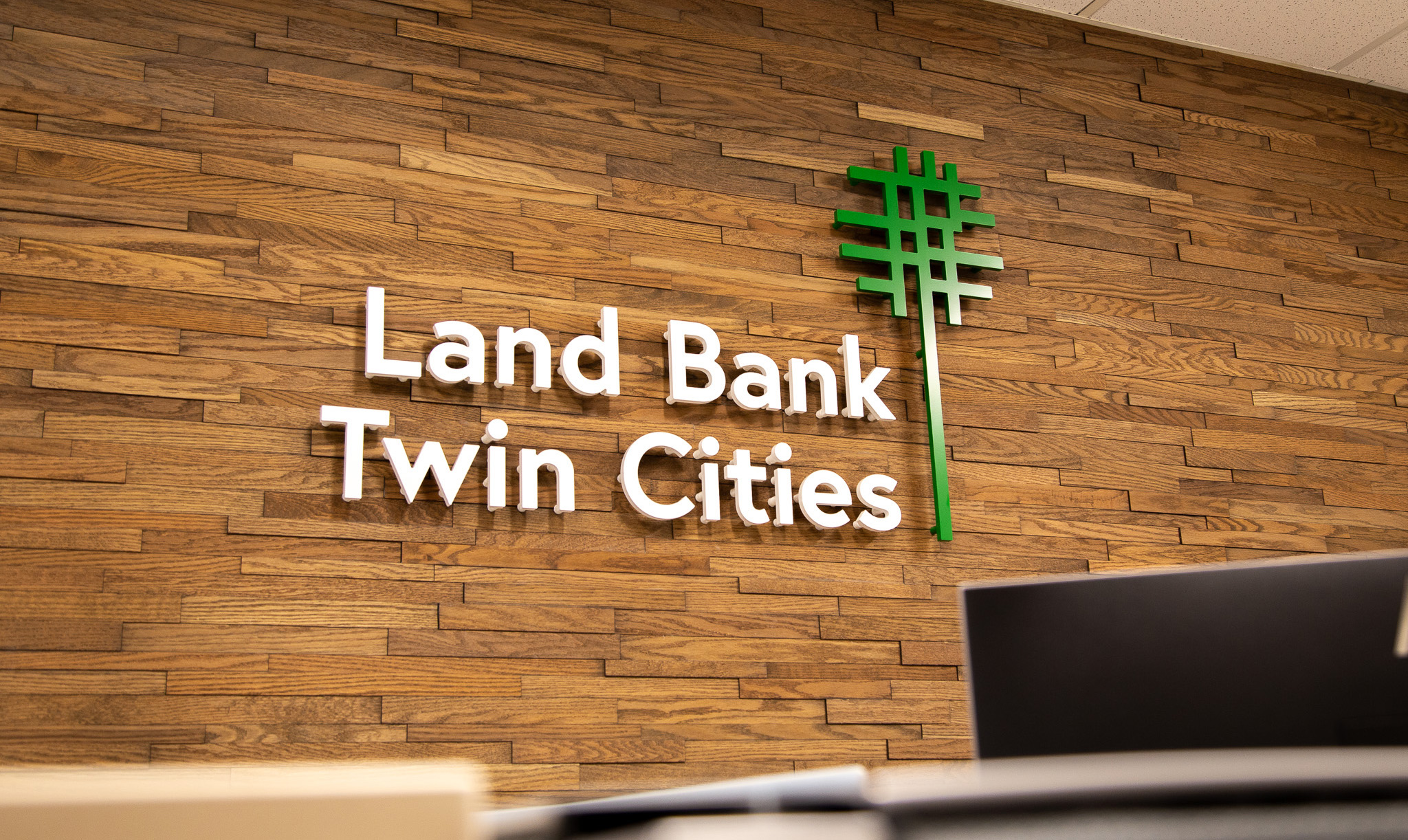
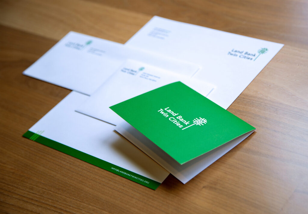
The new Land Bank Twin Cities logo embodies simplicity and strength. At its core, the tree-shaped icon—formed by a streamlined street grid—remains a powerful symbol of growth, opportunity, and community connectivity. By refining its structure and reducing visual clutter, the new logo ensures maximum impact across all applications. The updated two-tone color scheme enhances visibility, reinforcing the organization’s professional yet welcoming identity.
A brand refresh isn’t just about aesthetics—it’s about creating a better experience. As part of the transformation, Neuger worked with LBTC to elevate its website with:
Land Bank Twin Cities is poised to amplify its reach and impact with a stronger, more cohesive brand identity. The refreshed logo and website create a polished, professional presence that strengthens recognition and enhances engagement with key stakeholders, funders, and community partners.
As Land Bank Twin Cities continues to shape the Twin Cities real estate landscape, its revitalized brand ensures it remains at the forefront of economic mobility and community-driven development. With a clear, compelling identity, LBTC is well-equipped to drive lasting change—investing in land, creating opportunities, and building stronger communities for years.
Land Bank Twin Cities
Nonprofit
Branding
Web