A Modern Identity for a New Era
Moersch, Dorsey & Hahn, P.A
Moersch, Dorsey & Hahn, P.A. has been a trusted legal partner for years, known for its dedication to clients and strong presence in the community. As the firm grew and leadership evolved, it became clear that their visual identity needed to evolve too. With a move to a new office and a refreshed leadership structure, the firm saw an opportunity to create a brand that better reflected its future while still paying homage to its history.

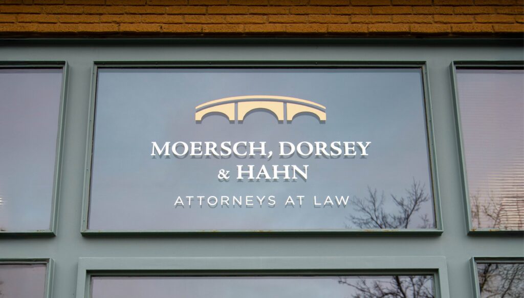
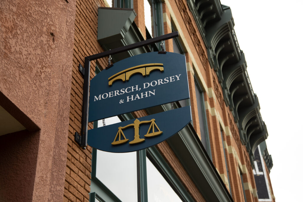
The firm’s previous logo featured an image of its longtime office building—an iconic structure that had been home for many years. But with the move to a new space, the firm needed a fresh look.

A New Purpose
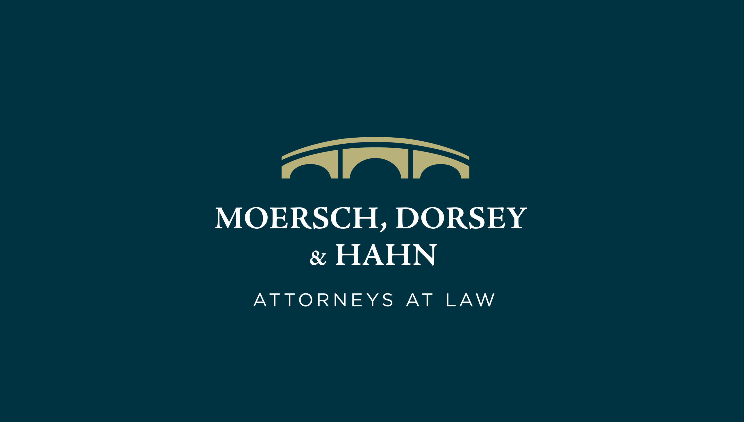
The new logo incorporates a bridge, symbolizing both their physical move across the Cannon River and their continued commitment to guiding clients toward solutions.
A New Meaning
The three arches within the bridge are a nod to the firm’s three Shareholder Partners, representing their unity and collective expertise. The modern, yet timeless design reflects the firm’s professionalism and forward-thinking approach.
A Cohesive Brand
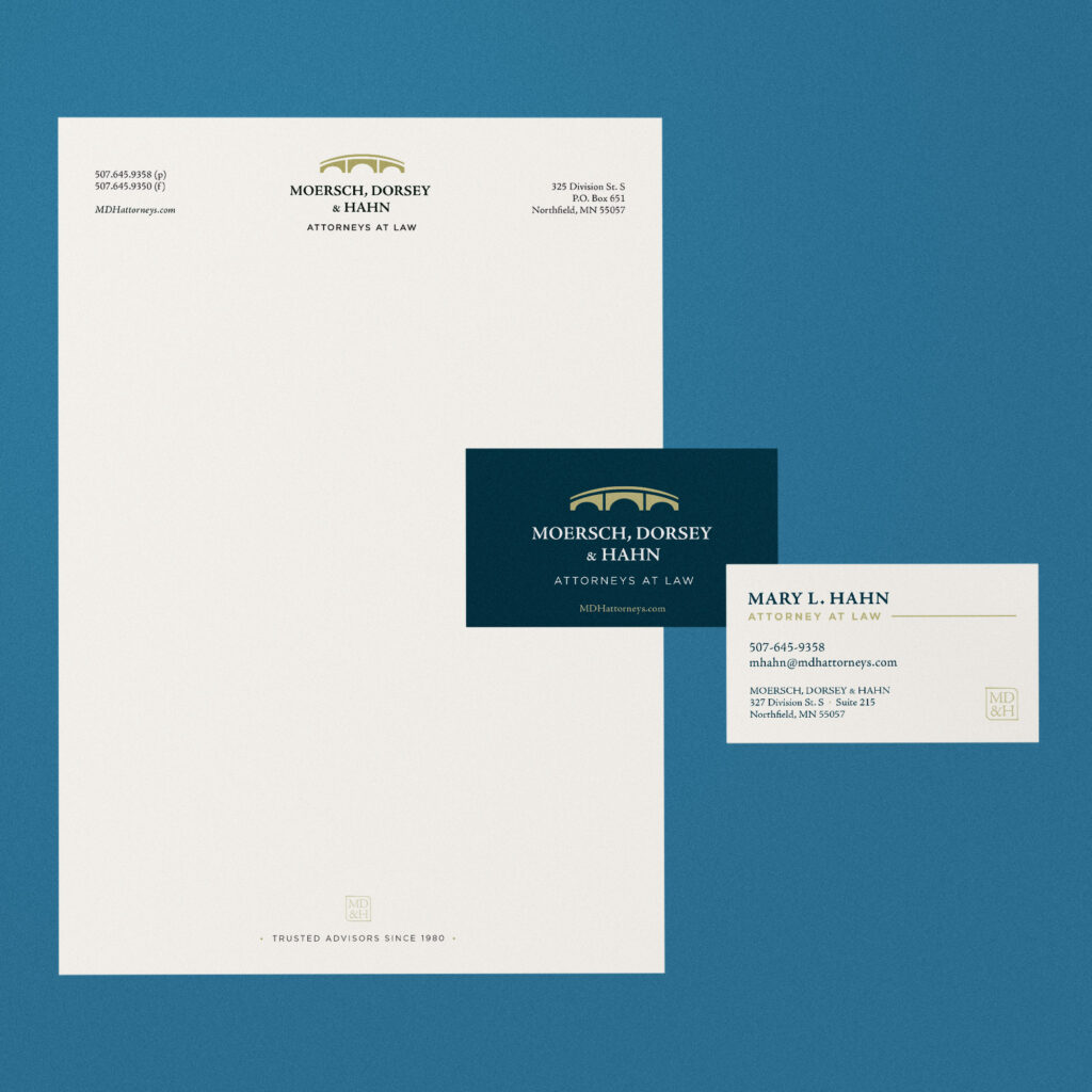
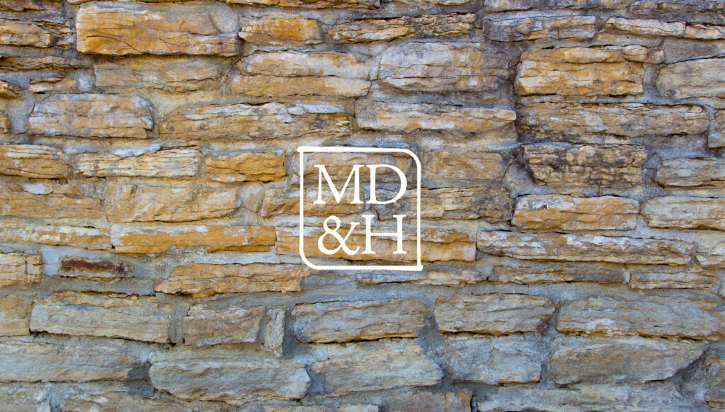
A rebrand is more than just a logo—it’s about creating a cohesive identity across all touchpoints. Along with the new logo and visual identity, we designed a full suite of branded business materials, including new business cards, letterhead, and other client-facing materials. These elements help reinforce the firm’s professionalism and make a lasting impression.
A Modern Look for a Modern Space
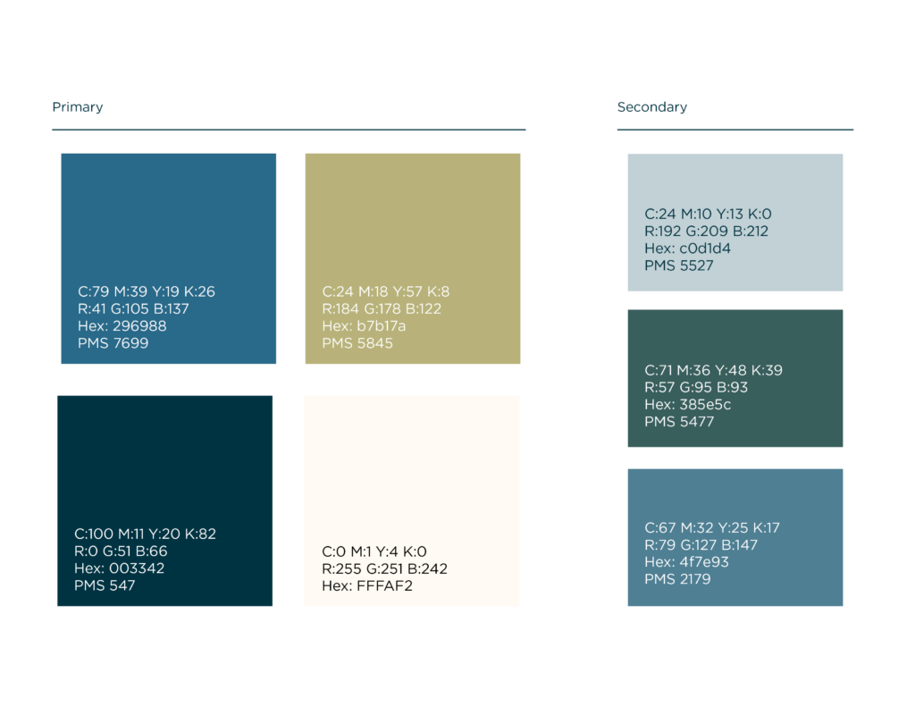
To complement the updated brand, we carefully selected a sophisticated typeface and color palette aligned with the firm’s reputation. These elements enhance the logo and create a seamless visual experience throughout their new office and on business materials. From signage to business, every detail reflects the firm’s continued commitment to excellence.
Across the Bridge
Moersch, Dorsey & Hahn, P.A. now has a brand identity that truly represents its future. With a name that reflects its leadership, a logo rich in meaning, and a suite of business materials that reinforce its professionalism, the firm is well-positioned for continued success. This rebrand is more than just a visual update—it’s a statement about where the firm is headed and its dedication to serving clients for years to come.
Client
Moersch, Dorsey & Hahn
Category
Legal
Professional Services
Services
Branding