A common practice for presenting data or complex information is to develop an infographic. These visual representations of written content guide the learner with key data points and facts, walking them through a subject step-by-step and often inviting them to read accompanying text nearby. But how can we adopt this trend while still creating content with meaning?
Speakers Jim Julian and Marty Holmstrom explored this question in our March CO.LAB, and below are the key points of their presentation.
About the Experts

Jim Julian
Senior Graphics Specialist at Neuger
Jim Julian, a native of Stevensville, Michigan, joined Neuger in 2019 after previously serving as a senior art director in the global creative department of Thomson Reuters. It was there where he met Marty Holmstrom and teamed up on many projects requiring engaging educational visuals.

Marty Holmstrom
Copywriter at Home and Hearth Technologies
Marty Holmstrom has a passion for good ideas that communicate clearly. The simpler the better. He helps move the needle on leads, sales, and user behavior focused on “What’s in it for the customer?” Marty collaborated with Jim at Thomson Reuters, and is now a content strategist and copywriter at Home and Hearth Technologies.
What is an Infographic?
An infographic is a visual used to represent information or data. It can include charts, diagrams, images or shapes to help add meaning to content.
Why Use Infographics?
Given that in 2020 the amount of content we consume each day nearly doubled, we need to develop ways to help convey meaning faster and do what we can to help readers recall information. The majority of people are visual learners, but complex data sometimes has better comprehension when delivered through text. So why not marry the two with an infographic?
Start With Great Content
The text you choose to accompany your infographic should be concise and helpful. Ask yourself the following questions when creating the content for your infographic:
- What is the one thing I want the reader to take away from this?
- Who is the audience for this infographic and what would I like them to do as a result of learning about this topic?
- How is your content helping your reader solve a problem?
- How can you position yourself or your organization as a trusted advisor on this topic?
A reader is likely to scan your infographic for headlines and visuals before your text, so make sure all text supports the story of the headlines and visuals and is highly valuable to the reader.
Supporting Visuals
It’s ideal for the copywriter to work alongside a designer to develop visuals for an infographic, like Jim and Marty. Together, your team can brainstorm the visuals that add the most meaning to the text. Here are a few ideas on how to creatively use visuals to support data and messaging in your infographic.

Experiment With Shapes on Graphs and Charts
Data is an extremely important element of an infographic, showing results and studies. Make sure your data is accurate and well-researched, and experiment with visuals that add to the meaning. Examples can include:
- a pie chart in the shape of a lock to show a percentage of survey respondents who are following security protocols
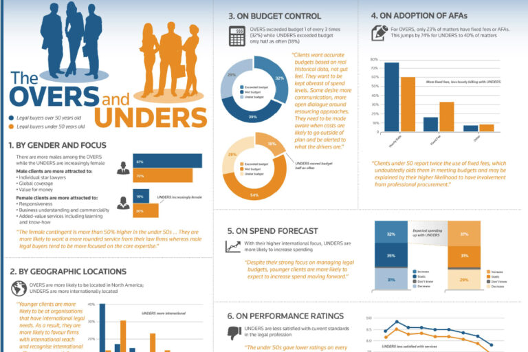
- a bar graph in the shape of a professional to show amounts of job opportunities
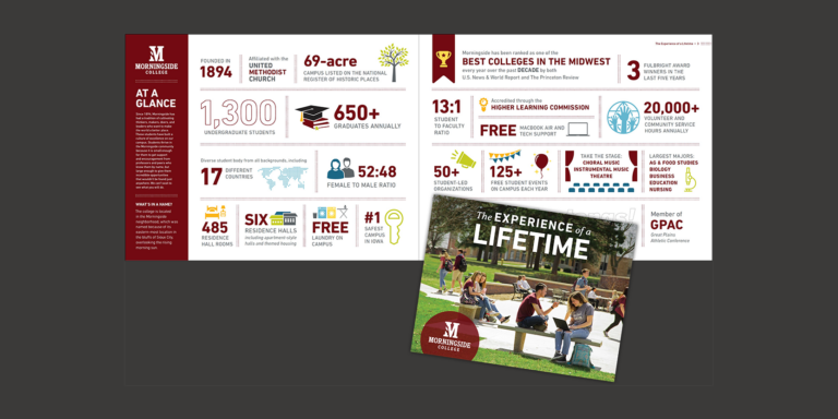
- a collection of mortarboard icons, some filled and some outlined to show graduation rates
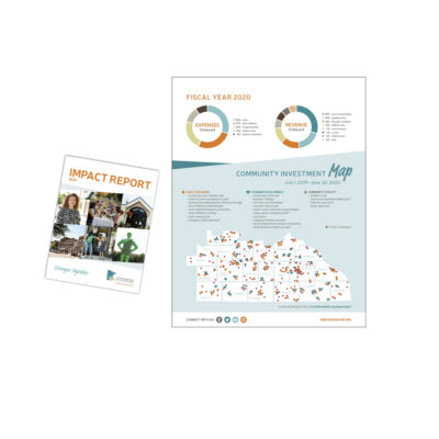
Leverage a Map
When there is geographical information to convey, help the reader visualize using a map. You can use a map to:
- identify single points of interest
- leverage a key for complex geographic information
- highlight regions effected by an issue
Make it Multimedia
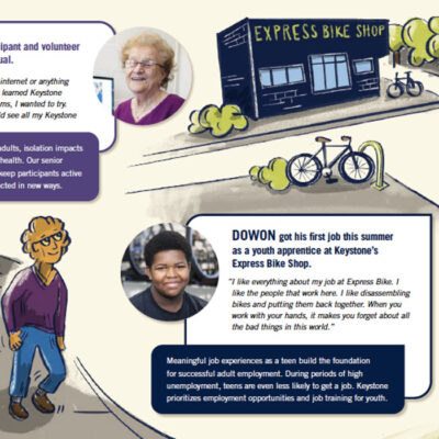
There are many ways to add additional media to your infographic. Keystone Community Service’s annual report to the community incorporated creative illustrations with photographs of individuals impacted by their services and brief text about their experience. Then they delivered their multimedia piece over a variety of media. Their team:
- mailed the report to constituents
- built a webpage where users could watch video testimonials from each of the individuals in the infographic
- drove users to the webpage via marketing emails
In Summary
An infographic is a highly valuable piece of content you can offer to your constituents and clients. Remember to include:
- meaningful headings
- concise text
- well-researched, helpful data
- supporting visuals
Need more ideas?
Jim and Marty highly recommend checking out USA TODAY Snapshots for additional inspiration. These simple visualizations include data, graphics and are highly sharable.