
Over the years, many website development trends have come and gone, but today we’re covering those that are here to stay.
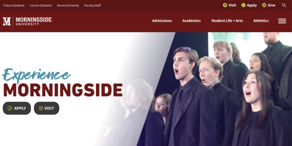
1. Hero Images
Hero images have been around since the traditional media days – they make an impression or set a tone. The analog equivalent is a large image that dominates the top half of a folded newspaper. We even use the term above-the-fold when discussing webpages. Above-the-fold is still applicable because you want to have compelling content at the top of your page and 53% of people don’t venture below-the-fold. While hero images are widely used, there are alternatives that may be more appropriate.
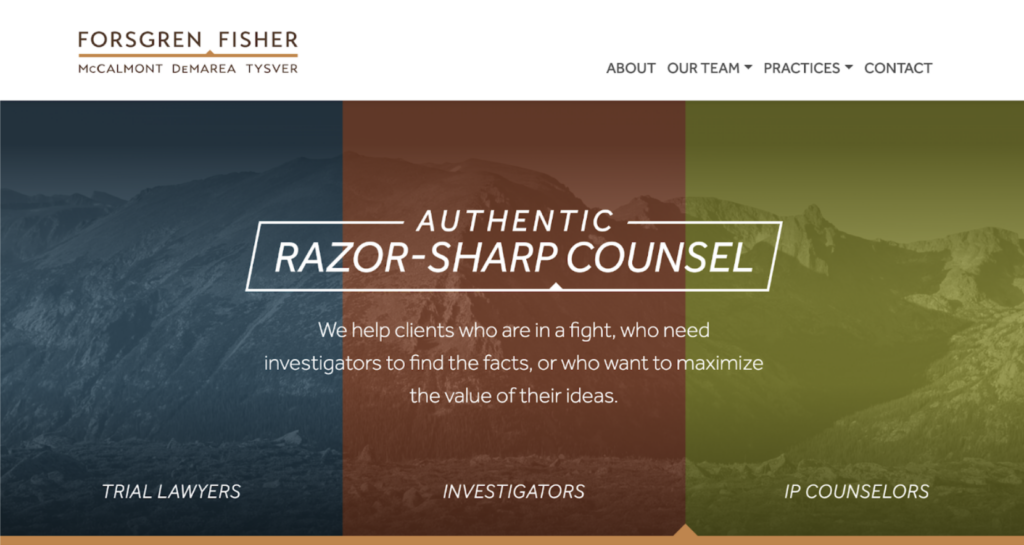
The Half-Page Hero
In this option, the hero image uses half of the main section, and text-based content is on the other half. This creates a visual impact and provides a dedicated space for important information.
The Anti-Hero
This prioritizes user action over a header image. Spotify is a great example. Their site prioritizes the music and creating playlists over having a large image and a title.
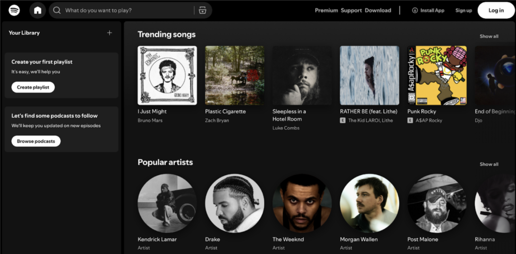
Search First
This is like any search engine or the front page of Amazon, where instead of a hero image there’s a search bar as the main item. This prioritizes what the site is intended for – searching first. These aren’t the most common hero styles, but they’re best for websites with high content volume or a user base with high transactional or informational intent.
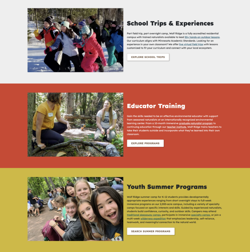
2. Using Authentic Images
The second trend is the use of authentic images. We have all seen sites that use stock or generic images, which can look cold/clinical or overly composed. They can get a point across, but not necessarily with the flair that a client’s brand requires or the authenticity that our clients expect. Authentic images are easier for your customers and clients to connect with, can enhance your brand and show them exactly what to expect when they work with you. Regarding AI-generated images, in most cases it’s best to avoid using them on a website. They are easy to generate, but as we’ve all seen, they can be error-prone and usually feel like stock images – devoid of real life.
3. Animations
Animations can be anything from large bouncing graphics to a subtle highlight on a box when you’ve selected it. Large animations can be distracting and focus should be on more subtle animations that support the content.
It’s always helpful for the user experience to have subtle indicators of actions that have been taken or can be taken on the page. By using subtle animation, you can draw attention to a specific place, change the state of an actionable space (such as a button), guide the user or make the interface feel more polished. Subtle animations can also do a lot to indicate directionality on a website and move your eye around the page in the way that the creator deems necessary, especially when there isn’t an obvious flow to the page.

4. Compelling Content
Previously, search engines prioritized keywords and phrases in their search results. However, they have adapted and now prioritize well-structured, well-written content over simple keywords. Your content should be tailored to your audience, clear and concise, prioritize scannability and include clear calls to action. Keywords are still important, but they should be used naturally and in a human-friendly way rather than adapting the content to them. By writing for your audience’s needs, you adopt a tone that they are familiar with and that engages them to read more. Using our AI-enhanced services, we can create content for clients that matches the tone. We conduct human editing and content review before we make it live. Clear and concise means that you’re not using jargon and complex concepts. Instead, adopt an 8th-grade reading level. Using online tools, like the Perry Marshall Readability Test, can help you maintain an appropriate language level.
Building Websites That Last
Some trends come and go, but we believe that these trends are here to stay because they directly benefit the user experience.